The Ivey Logo
Logo

The Logo is one of the most important visual components of the Ivey brand identity. Its function is to clearly and strongly identify our Faculty, and its typography and colour are unique. The components of the new Ivey Logo are the shield and custom Ivey wordmark that is a refinement of the previous iteration.
Used consistently the Logo will be associated with excellence and all the qualities our institution represents.
The Logo is a custom element and should only be reproduced from authorized electronic artwork. Any substitution or alteration of the Visual Identity is not acceptable.
Full Signature

The Full Signature incorporates the name of the Faculty along with the descriptor and locator. Outside of London, Ontario, it's important to use this identity, with the "Western University, Canada" descriptor. It immediately identifies Ivey as part of Western University in Canada.
Logo vs. Full Signature
The Logo should be used predominantly for internal communications such as email, or PowerPoint presentations. The Full Signature should be used predominantly for formal uses such as proper documentation, commercial collateral or the Annual Report. For direction on the usage of the Ivey Logo or Full Signature contact the marketing department.
Simplified Shield

To ensure clear legible reproduction of the shield at very small sizes, the Ivey Logo has a "simplified shield." The simplified shield should be used when the shield is smaller than 8mm wide, and must always accompany the Ivey wordmark. It must never be used on its own or altered in any way as this compromises the integrity of the Ivey brand.
For full details please reference the Ivey Standards Manual. Use of the simplified shield requires approval from the marketing department.
Ivey Sub-Brands
The Ivey logo has been designed to represent the entire institution - it is our parent brand.
The institution, however, is made up of a number of Departments, Institutes and Research Centres, and Student Clubs which constitute our sub-brands. Maintaining a consistent relationship between the parent and sub-brands is of vital importance to building value in the Ivey name overall. Specific rules therefore apply in the application of any sub-brand signatures.
A logo system has been developed for all the programs, departments, institutes and campuses, which are available in both the logo and full signature. No new logo configurations should be developed without consulting the marketing department. To download logos or full signature visit the downloads page, and if you require further assistance please contact submit a request.
Logo Usage
Clear Space
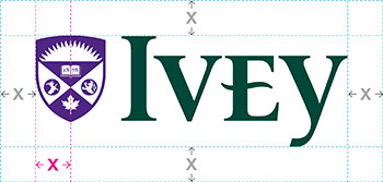
The Logo and Full Signature must be placed within a specific isolation area. This gives the identities presence when used in combination with other identities or graphic elements. The clear space is defined by half the width of the shield.
Sizing

Minimum sizes of the Identities have been established to maintain legibility.
The minimum size for the Logo is 1" wide, and the minimum size for the Full Signature is 1.0625" wide.
Incorrect Use
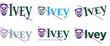
The Logo and Full Signature must be used correctly to ensure that its visual impact and integrity are not diluted or compromised. Always reproduce the Identities from approved electronic artwork only. These examples are not intended to form a complete list.
One Colour Use

The Full Signature and Logo should only be used in black where colour is not permitted. The Identities in black can be used on stainless steel water bottles or signs and other ephemera, as well as, exceptional print circumstances (newspapers, black and white digital reproduction, etc.)
The positive version of the Full Signature and Logo can be used in black. The only exception is when black and white photocopies are produced within the university community.
The reverse version of the Full Signature and Logo should be used only in white.
In cases where the colour Identity needs to be used on an image, it should be placed in a white box, according to the clear space area.