Calls to action are a perfect way for editors to highlight an important action they would like visitors to take.
In order to add a new call to action, click on Add content and then choose Call to action.

Insert a Call to Action
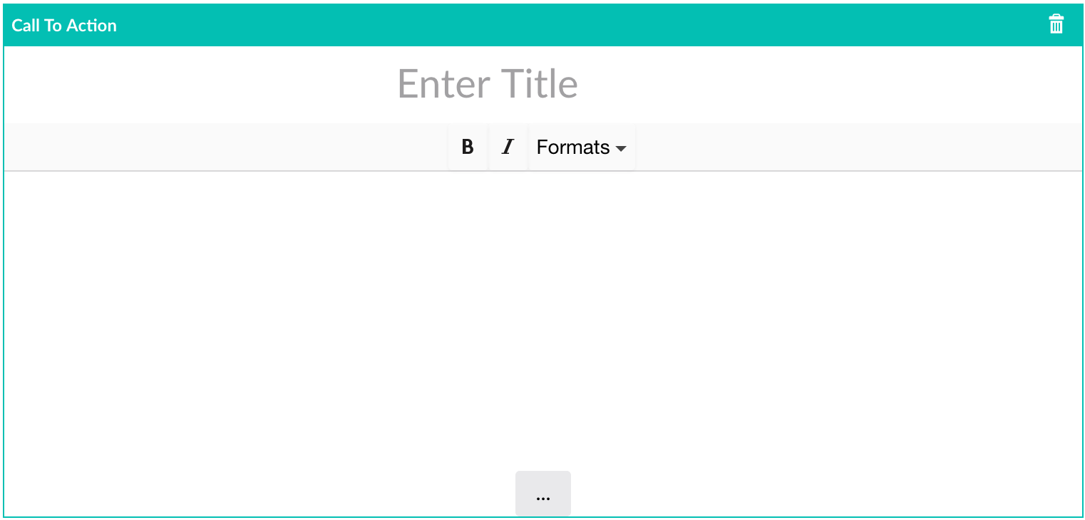
After you add a Call to Action to the Grid, you will see a section that says "Call to Action" and prompts you to enter a title.

There are three components to the Call to Action.
- Title
- Supporting Copy
- Button
The title appears at the top of the call to action as an H3 heading.
The supporting copy appears as a paragraph below the title. You can add simple formatting to it (bold, italics, and headings).
Finally, a button appears at the bottom of the call to action.

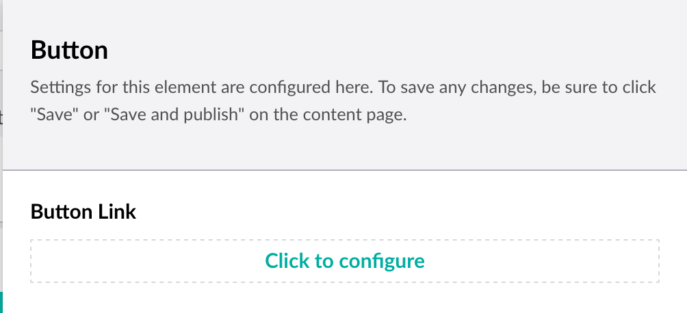
The configuration for the button is very similar to the Button block. Click on "Click to configure", pick an internal, external, or media link, and give your button a title.
The main difference is that all Call to Action buttons are a medium size button for consistency.
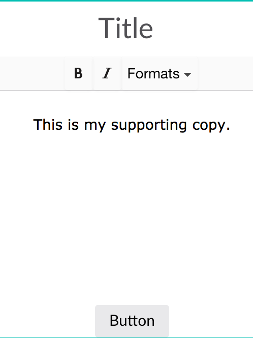
Here is what a completed Call to Action block looks like:
